
As we move into the new year and Spring 2014 collections hit stores, something to have in mind are this year’s color trends. Recently the Pantone Institute, the renowned world color authority in fashion and our color trend reference, published their Color Report Spring 2014. The report identifies the pastel color palette as the key reference for this year’s fashion trends.
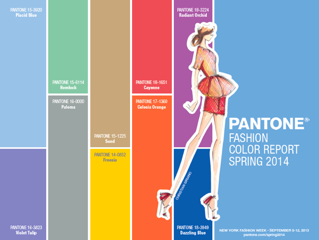
The pastel palette reflects emotional stability and tranquility and is a must for 2014. The shades selected for the coming season are: Placid Blue, Violet Tulip, Hemlock, Sand, Paloma, Cayenne, Freesia, Celosia Orange, Radiant Orchid, and Dazzling Blue.
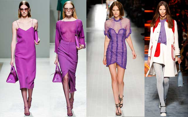
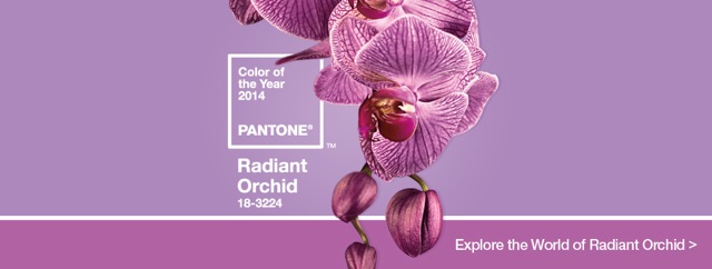
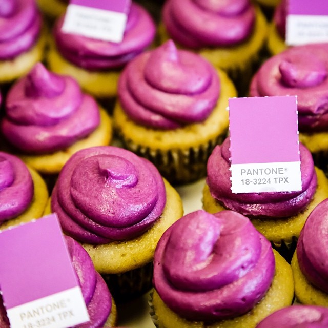
Named as this year’s it color in Pantone’s report is the shade Radiant Orchid; a color that called our attention from the catwalks of many Spring / Summer 2014 fashion shows. Radiant Orchid is a color that not only attracts attention and awakes the imagination, but according to the Pantone Institute, also transmits happiness, love and health.
The violet tone, is the color of the ambivalent feelings, of power, penitence and restraint. No other color offers such range of qualities and characteristics that coexist together in the same tone: the passion, strength and character of red, together the tranquility, peace and calm of blue.
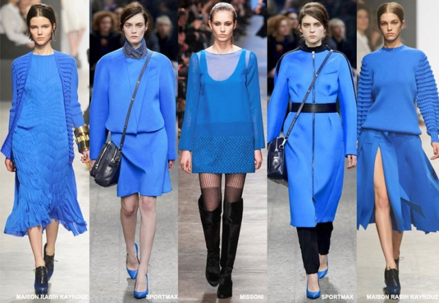
Pantone’s decision to select Radiant Orchid as 2014’s it color sparks a hot debate however; Another color reference in the fashion world, and one of few firms that specialize in color trends, the International Color Authority (ICA), recently named Costa Brava Blue as the predicted trending color for the coming season.
Costa Brava Blue is the result of a mixture of blue tones. It is a cheerful blue, similar to Sky Blue, but as its name suggests, is inspired by the Costa Brava.
It’s hard to say what is the exact shade of Costa Brava Blue, but as its name insists, we can use the color of the Catalan coastal area that extends from the Costa Vermella to the Costa del Maresme as a reference. In some cases, the color Costa Brava Blue could be interpreted as a tone close to the color Dazzling Blue proposed by Pantone in it’s 2014 Spring / Summer Color Trend Report, or to Pantone’s Color of the Millennium, Cerulean Blue.
 In general, blues are a favorite for everyone, which is difficult to say for Pantone’s violet tones. Although a cooler tone, blue is known as the color of harmony and fidelity and while it holds masculine qualities, it can also be very feminine.
In the end, what is most important for this season’s trends not only depends on colors, but how you wear them. Many designers for Spring / Summer 2014 have chosen to give a modern edge to their collections by mixing pastel shades with more vibrant and intense tones to create harmony between the force of different colors. This combination of modern with traditional aims to refresh, revitalize and defy conventional wisdom.
So what is your favorite for Spring / Summer 2014? Violet Orchid or Costa Brava Blue? And most importantly, how will you chose to wear them?